Cancer Data Science Pulse
Visualizing RNA-seq Data—Pro-Tips From an NCI Bioinformatics Engineer
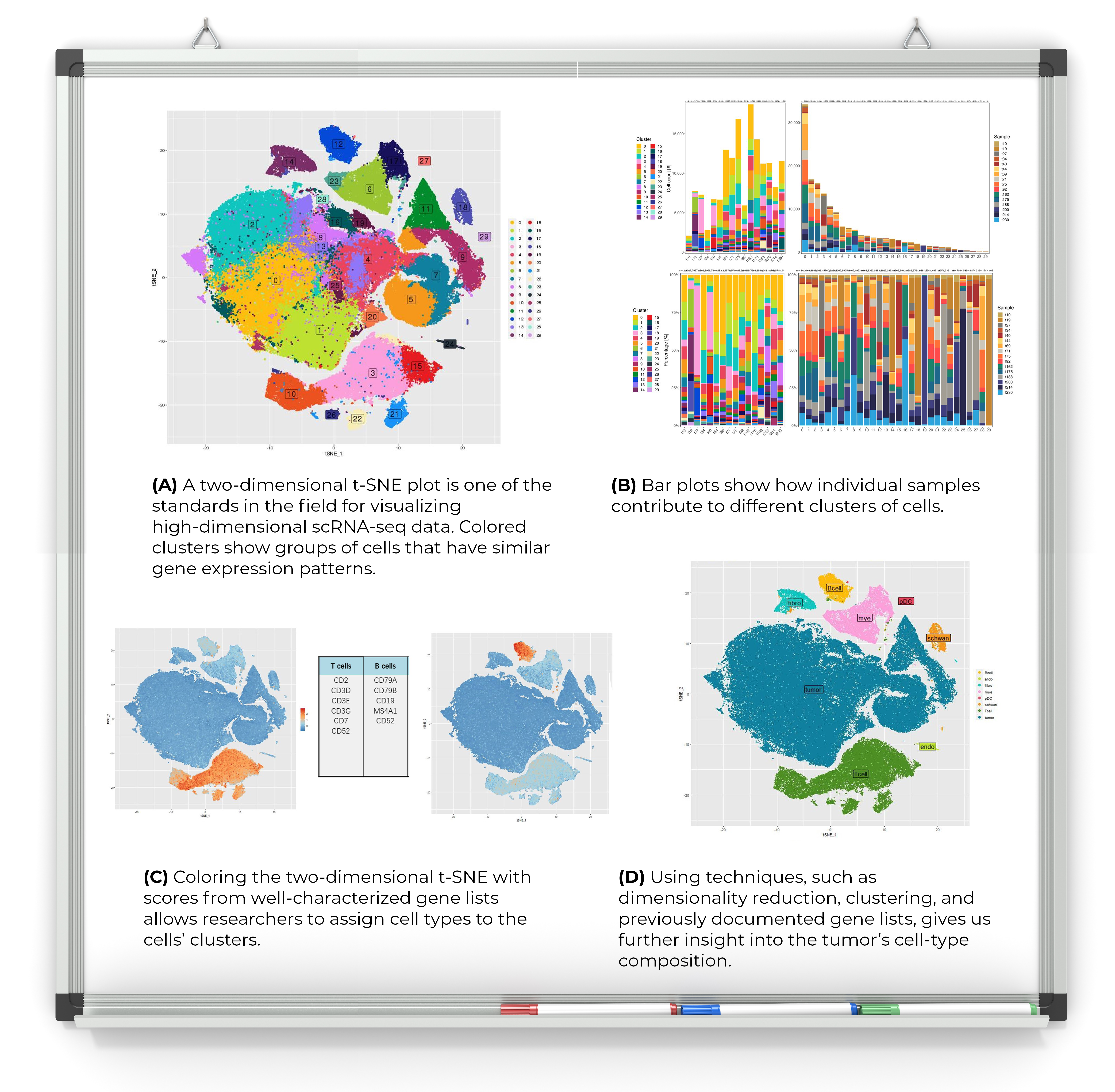
In this new blog series, we're posting samples and tips on visualizing cancer data. To kick us off, Dr. Alida Palmisano, a bioinformatics engineer in the Biometric Research Program in NCI’s Computational and Systems Biology Branch, Division of Cancer Treatment and Diagnosis, shares her ideas for visualizing complex single-cell RNA-sequencing (scRNA-seq) data.
Our hope is that these images will spark your imagination when showcasing your research data.
What type of graphic is it?
It’s a composition of various plots for single cell transcriptome sequencing data. scRNA-seq measures the RNA molecules within each cell of a given sample to provide a snapshot of the cells’ transcriptome (i.e., the genes that are being transcribed when the cells are collected).
Why is the graphic important?
With scRNA-seq, we can use a single experiment to capture a moment in time in highly heterogenous tissues. We can see the genes that are being transcribed (i.e., the transcriptome), composing many dynamic biological processes. The high dimensionality of the data (e.g., large numbers of genes and cells, complex biological processes) is a challenge that requires a variety of visualization strategies, which have to work together (like a puzzle) to reveal helpful biological insights.
How did you create it?
I generated the figures with R, using a popular package for single cell data analysis called Seurat. Additional visualization like bar plots were generated using ggplot.
What should I consider when visualizing this kind of data?
Remember that the underlying data are extremely high dimensional. Using a single visualization approach will give you a limited view of the information, which can be extremely biased! Select a visualization strategy that addresses your hypothesis and make sure that each “piece of the puzzle” fits together in a way that leads to useful information. Also, remember that all the tools have many tunable parameters that may greatly impact the way the figures look and ultimately the hypothesis you derive from them.
What’s your favorite and why?
In general, my favorite visualization type is bar charts because they can embed a lot of complexity without affecting their overall intuitive interpretation. You can use colors, patterns, order, orientation, and much more to convey both simple and complex messages. However, bar charts, as with any other visualization type, have their limitations. Always remember to visualize the same data in several different ways to see which combination of techniques tells the story you want to share.
Leave a Reply
Categories
- Data Sharing (66)
- Informatics Tools (42)
- Training (40)
- Precision Medicine (36)
- Data Standards (36)
- Genomics (36)
- Data Commons (34)
- Data Sets (27)
- Machine Learning (25)
- Artificial Intelligence (25)
- Seminar Series (22)
- Leadership Updates (14)
- Imaging (13)
- Policy (10)
- High-Performance Computing (HPC) (9)
- Jobs & Fellowships (7)
- Semantics (6)
- Funding (6)
- Proteomics (5)
- Information Technology (4)
- Awards & Recognition (3)
- Publications (2)
- Request for Information (2)
- Childhood Cancer Data Initiative (1)
Monika Davare on October 07, 2022 at 11:28 a.m.