Cancer Data Science Pulse
Visualizing Data Using Circular Heatmaps and Biplots—Pro-Tips From NCI Researchers
We’re continuing our blog series on data visualizations with a look at circular heatmaps and biplots. This blog features images and tips from Drs. Arashdeep Singh and Sridhar Hannehalli of NCI’s Center for Cancer Research. For more on this topic, check out the previous blog, “Visualizing RNA-seq Data—ProTips From an NCI Bioinformatics Engineer,” by Dr. Alida Palmisano.
What type of graphic is it?
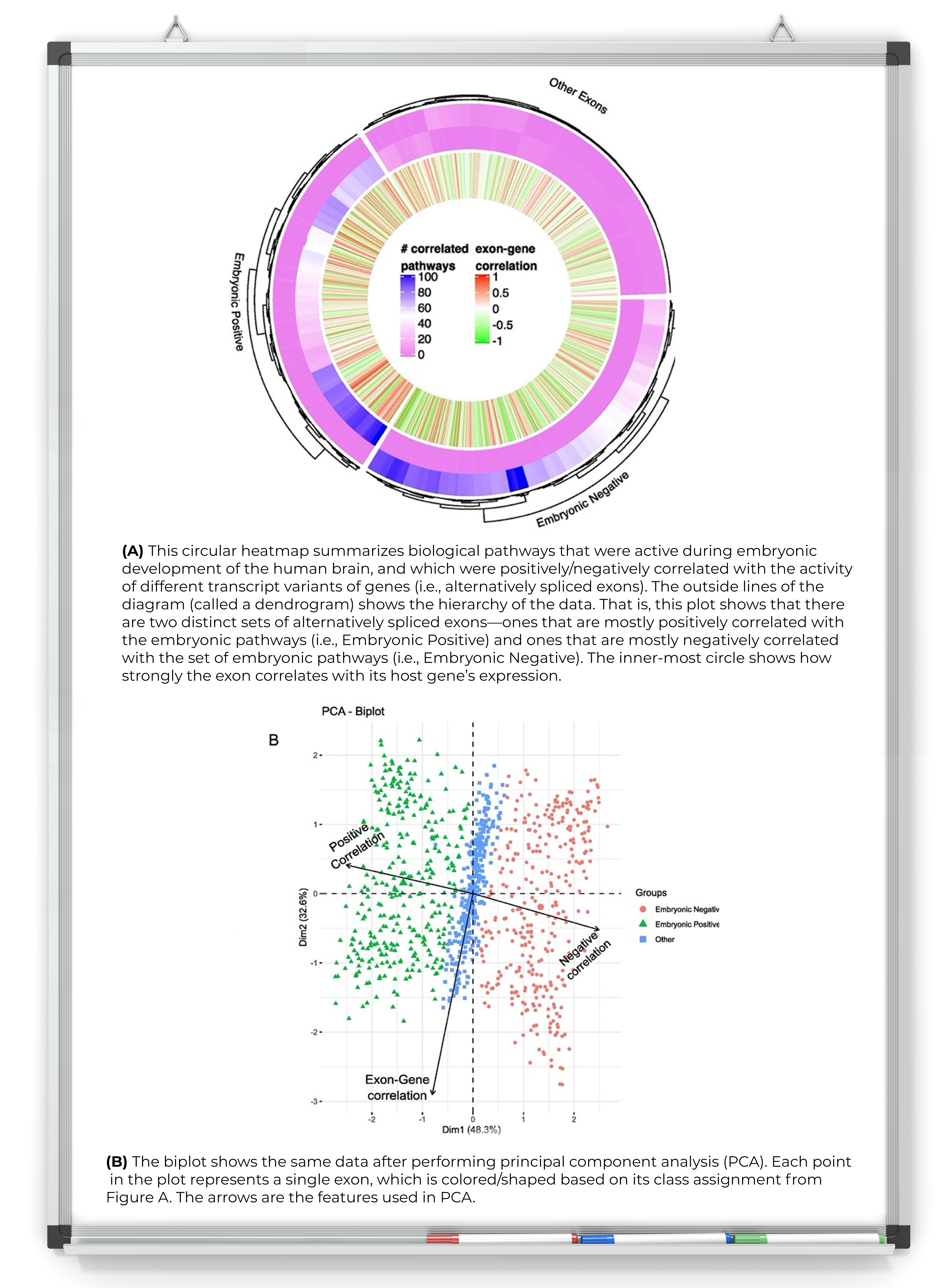
Here, we’re showing a heatmap in a circular layout. Heatmaps are a popular method for visualizing high-dimensional data consisting of two or more variables. For example, a heatmap helps to show the ‘N’ (number of observations) associated with ‘C’ (number of features). We use color and shading to differentiate numeric data values. The circular layout is particularly useful, as it renders complex information in a meaningful way, allowing you to see the strongest or most relevant results quickly and easily.
Why is the graphic important?
We use heatmaps to show the expression of genes and proteins (or other observations) in the samples we’re probing. We often use heatmaps in conjunction with hierarchical clustering of observations and/or features to help us quickly see the associations between distinct observations (such as genes) and features (such as patients). In Figure A, the diagram on the outside of the circle (i.e., the tree) offers insight into how an observation (e.g., alternatively spliced exons) fits together with other groups of observations (e.g., whether those exons were most active during embryonic development, i.e., “Embryonic Positive” in the figure). In general, let’s say a biologist measures the expression of 100 genes across 10 cancer patients. Heatmaps with hierarchical clustering can provide a quick glimpse into the level of gene activity across patients (coded by color scale in the heatmap), as well as identify the genes with similar activity across patients.
How did you create the graphic?
We created our plot using the circlize package in R programming language. This package provides a framework to circularize multiple user-defined graphics functions for visualizing the data. You can find other forms of visualizations that use a circular layout on GitHub.
What should I consider when visualizing this kind of data?
When generating high-dimensional data visualizations, it’s important to use the same units of measurement so you can accurately compare results. If that’s not possible, there are ways to handle differences in data. For example:
- Use standard measurements (or z-scores). Z-scores allow you to calculate the value of a data point by considering the standard deviations above or below the average.
- In some cases, use log transformation of the data (or a subset of features), particularly if the measurements are skewed.
Also keep in mind that rendering a circular layout along with hierarchical clustering can be a slow and memory-intensive task for most computers. Be sure you have the necessary computational resources for managing your data size. Consider too that some calculations can be done in the cloud (such as using NIH's Biowulf), making it easier to manage large data sets and complex visualizations.
What’s your favorite way of visualizing data and why?
One of our favorite ways of visualizing data is using biplots generated from principal component analysis (PCA). PCA analysis is particularly useful when we’re considering multiple correlated variables in the data. For example, we might use this type of analysis to examine data from several different points in time or multiple patients so we can capture changes in cancer as it occurs over many weeks or months, or across patients.
Using biplots, we can simultaneously visualize subgroupings/clusters among observations and features, pretty much like heatmaps, but with a key advantage: We’re able to discard some of the variation in the data, either from technical noise or rooted in systematic confounders such as age or sex of the patients. Such variations might adversely affect the observations, in addition to factors being investigated (i.e., expression of certain genes in patients in response to drug X).
Categories
- Data Sharing (66)
- Informatics Tools (42)
- Training (40)
- Precision Medicine (36)
- Data Standards (36)
- Genomics (36)
- Data Commons (34)
- Data Sets (27)
- Machine Learning (25)
- Artificial Intelligence (25)
- Seminar Series (22)
- Leadership Updates (14)
- Imaging (13)
- Policy (10)
- High-Performance Computing (HPC) (9)
- Jobs & Fellowships (7)
- Semantics (6)
- Funding (6)
- Proteomics (5)
- Information Technology (4)
- Awards & Recognition (3)
- Publications (2)
- Request for Information (2)
- Childhood Cancer Data Initiative (1)


Leave a Reply