How to Use Circle Plots for Visualizing Multi-Omics Data
What Is OmicCircos?
OmicCircos is an application available from Bioconductor and built by Ying Hu and Chunhua Yan from Daoud Meerzaman’s team in NCI CBIIT’s Informatics and Data Science Program.
OmicCircos works in “R,” a programming language that helps you manage, analyze, and visualize your data. With OmicCircos, you can generate high-quality circular plots from your omics data.
Why Should I Use It?
OmicCircos lets you show your data in a circular visualization, which is particularly useful for visualizing genetic information.
Seeing data in a circular schematic has several advantages. This format lets you:
- compare a “normal” or reference genome against your genetic information so you can easily spot where genes or gene variants differ (or are the same).
- see the relationships between the position, size, and direction of genes and gene products.
- spot sections of interest (that you might want to explore further or zoom in a region).
- integrate different types of data so you can see how genes and gene products link to other types of data, such as interactions among mutations, copy numbers and expressions in human genome, associations with clinical features, and clinical image features.
By mapping and linking genetic data, you can see the position of each chromosome. You can spot variations of genes and show the expression and copy number change of same genes simultaneously. In short, by visualizing genetic information with circle plots, you can readily profile the most important aspects of your data.
How Do I Use OmicCircos?
Before you begin, be sure to have recent versions of Bioconductor (3.18 or newer) and R version (4.3.0) installed on your computer. Then, follow the instructions for downloading the Bioconductor package.
The OmicCircos R package includes three primary functions:
- The sim.circos function lets you create simulated input data sets with specific formats required by the OmicCircos package. With this function, you can practice formatting your data for use in the package. Using this function, you can use test data to create a template before applying it to your actual data.
- The segAnglePo function lets you transform your input data from a linear format into angle-based coordinates along a circumference. You can use this function to make a circular plot for your data set that’s not linked to a human or mouse genome. That provides the flexibility to visualize any tabular data in a circular plot.
- The circos function enables you to create the circular shape for your figure. This final function offers over 30 different plot types and lets you choose the right plot for your data.
Once you’ve used one of these functions to set up your circle, you can use other shapes and visual effects (like scatterplots, lines, and heatmaps) to add detail.
- Use lines and scatterplots to show gene expression data and to visualize abnormalities (such as deleted, duplicated, or rearranged chromosomes, where there is a loss or gain of genetic material).
- Add curves and polygons to easily visualize structural variations common to cancer (such as translocations in which neighboring genes fuse into hybrid genes to create new proteins).
- Integrate boxplots, histograms, or heatmaps to show more layers, including multiple gene expressions or several data sets in one graphic.
You can see some of the visual effects mentioned here in Figure 1, which maps 15 different samples (i.e., breast cancer Her2 subtype samples) from The Cancer Genome Atlas data. The tracks, from the outside of the circle to the inside, show:
- chromosomes,
- gene expression heatmaps,
- copy number variations,
- the correlation between gene copy number variations and expressions, and
- gene fusions.
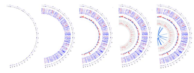
Here is an example of how these tracks look when shown in a circular format.
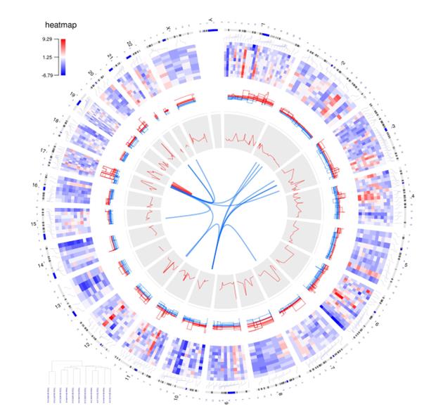
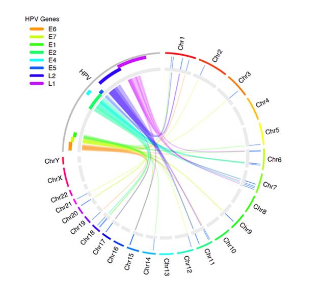
Figure 2 shows how you can use OmicCircos to visualize the links between the human papillomavirus (HPV) genome and human genes. Experts recognize HPV infection as the cause of cervical cancer, as well as other cancers.
Want to Try OmicCircos?
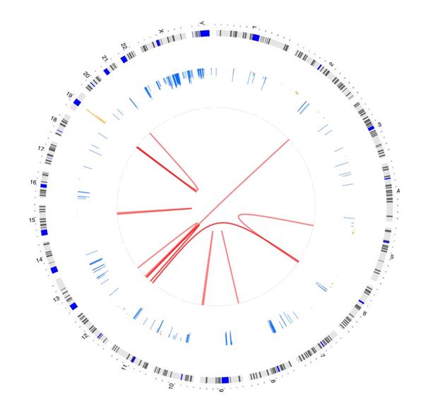
Ready to try OmicCircos? Figure 3 shows a sample visualization. You can find the code for creating the graphic in the callout box below.
# Remove all objects from the current R session to start with a clean environment
rm(list=ls());
# Load the OmicCircos library, which is used for generating circular plots for omics data
library(OmicCircos)
## Get input file names
cfile <- dir("../data_sets/OMIC_CNV1", "txt")
## Define a color palette with 10 semi-transparent colors
cols <- rainbow(10, alpha=0.5)
## Loop over the input files to generate circular plots for each
for (i in 1:length(cfile)){
## Extract the current sample and its primary site
id.n <- cfile[i]
## Construct file paths for the CNV
infile <- paste0("../data_sets/OMIC_CNV1/", cfile[i])
## Read CNV data
cnv <- read.table(infile, sep="\t", header=T)
## Construct file paths for the FUSION
inf2 <- paste0("../data_sets/OMIC_FUSION/", cfile[i]);
## Read fusion data
dat <- read.table(inf2, sep="\t", header=T)
## Calculate cutoff of CNV
c.m <- mean(cnv[,3])
## Define an output file name for the circular plot PDF
pdff <- paste0("../out/", id.n, ".pdf")
## Create a PDF device for plotting, with a size of 8 by 8 inches
pdf(pdff, 8, 8);
## Set the margins of the plot
par(mar=c(2, 2, 2, 2));
## Initialize a blank plot with custom dimensions
plot(c(1,800), c(1,800), type="n", axes=F, xlab="", ylab="", main=id.n);
## Plot the chromosomes on the circular plot with specified radius, chromosome annotation, and scaling
circos(R=350, cir="hg19", W=10, type="chr", print.chr.lab=T, scale=T);
## Add copy number variation (CNV) data to the circular plot
circos(R=200, cir="hg19", W=160, mapping=cnv, col.v=3, type="b2",
B=F, lwd=1, cutoff=c.m, col=cols[c(2,7)]);
## Add fusion data to the circular plot as links
circos(R=200, cir="hg19", mapping=dat, type="link", lwd=2, col=cols[1]);
dev.off()}
A GitHub page has detailed information on accessing OmicCircos, along with additional samples and code you’ll need for creating these images.