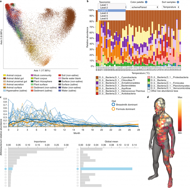
Figure shows the variety of visualization tools offered in QIIME 2. (a) A scatterplot of 37,680 samples shows the scalability of QIIME 2, with colors representing the sample type. (b) An interactive taxonomic composition bar plot allows users to visualize microbial sample compositions. (c) A volatility plot gives users a way to track microbiome composition over time. The bar charts offer an interface for further visualizing volatility plots (line plots) of individual features according to their significance. (d) A molecular cartography (here showing human skin surface) allows users to create three-dimensional models to capture specific spatial patterns. From: Reproducible, interactive, scalable, and extensible microbiome data science using QIIME2.

